Discussions and comments on The Corroseum website, its articles, features and reviews.
DaN
Administructor
Posts: 7233 Joined: Thu Jun 15, 2006 9:19 amLocation: Stockholm Metal Underground
Contact:
Post
by DaN Fri Oct 23, 2009 7:18 pm
daniel wrote: And hey, all you owe me is a rip of that Cleveland compilation
Done!
DaN
Administructor
Posts: 7233 Joined: Thu Jun 15, 2006 9:19 amLocation: Stockholm Metal Underground
Contact:
Post
by DaN Fri Oct 30, 2009 11:58 pm
bigfootkit wrote:
SOLD! I'm definitely using this one. Huge thanx!
bigfootkit
Posts: 3163 Joined: Wed Mar 19, 2008 12:32 amLocation: Scotland
Contact:
Post
by bigfootkit Sat Oct 31, 2009 1:11 am
Glad you liked it Dan, my pleasure.
All those years of defacing school books with band logos finally paid off!
Dark Stranger
Posts: 363 Joined: Fri Nov 13, 2009 1:43 pmLocation: Ireland
Post
by Dark Stranger Sun Nov 15, 2009 2:16 pm
That Links logo is awesome man! Exactly like something you'd see on an 80s LP! Sort of puts me in mind of the Axxis logo.
bigfootkit
Posts: 3163 Joined: Wed Mar 19, 2008 12:32 amLocation: Scotland
Contact:
Post
by bigfootkit Sun Nov 15, 2009 7:52 pm
Dark Stranger wrote: That Links logo is awesome man! Exactly like something you'd see on an 80s LP! Sort of puts me in mind of the Axxis logo.
Oh yeah, i see what you mean about the Axxis logo. Not intentional, but i'll take the praise anyway.
Thanks for the kind words.
daniel
Posts: 1992 Joined: Fri Jan 11, 2008 5:50 pmLocation: Physically here, Mentally there
Post
by daniel Mon Nov 16, 2009 3:36 am
Are you the tyrant, who cast them to the sea?
Ernest Thesiger
Posts: 6480 Joined: Mon May 14, 2007 12:25 amLocation: M/cr, GBR
Contact:
Post
by Ernest Thesiger Mon Nov 16, 2009 5:24 am
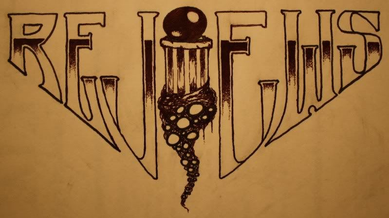
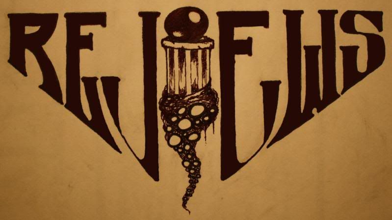
"REJEWS"? The pillar in the middle's great tho'.
"His name's Antichrist Vandelay. He's an insulter-expulser."
Chafe
Posts: 370 Joined: Fri Sep 21, 2007 8:07 amLocation: Chile
Contact:
Post
by Chafe Mon Nov 16, 2009 5:57 am
I think the same, the V looks WAY too much like a J
daniel
Posts: 1992 Joined: Fri Jan 11, 2008 5:50 pmLocation: Physically here, Mentally there
Post
by daniel Mon Nov 16, 2009 1:29 pm
Sometimes you have to look at a logo a bit longer to understand it, and it would look shit drawing the 'V' in any other way here.
Are you the tyrant, who cast them to the sea?
daniel
Posts: 1992 Joined: Fri Jan 11, 2008 5:50 pmLocation: Physically here, Mentally there
Post
by daniel Mon Nov 16, 2009 1:36 pm
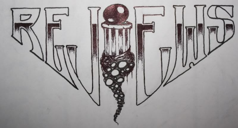
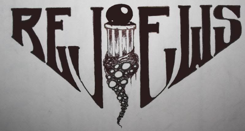
Like this then?
Actually it doesn't look too bad haha.
edit: redesigned it a bit
Are you the tyrant, who cast them to the sea?
Ernest Thesiger
Posts: 6480 Joined: Mon May 14, 2007 12:25 amLocation: M/cr, GBR
Contact:
Post
by Ernest Thesiger Mon Nov 16, 2009 5:51 pm
^^^ Yeah, that's definitely more elegant. Great work!
"His name's Antichrist Vandelay. He's an insulter-expulser."
Dirty Rocker
Posts: 1603 Joined: Tue Jul 25, 2006 1:54 pmLocation: Sweden
Post
by Dirty Rocker Mon Nov 16, 2009 5:59 pm
daniel wrote: Like this then?
Actually it doesn't look too bad haha.
edit: redesigned it a bit
THIS LOOKS FKIN AMAZING, Daniel!! Grrreat work.
THE DAWN OF THE MEGA-METAL
bigfootkit
Posts: 3163 Joined: Wed Mar 19, 2008 12:32 amLocation: Scotland
Contact:
Post
by bigfootkit Mon Nov 16, 2009 9:10 pm
Dirty Rocker wrote: daniel wrote: Like this then?
Actually it doesn't look too bad haha.
edit: redesigned it a bit
THIS LOOKS FKIN AMAZING, Daniel!! Grrreat work.
Excellent stuff! I love the Lovecraftian unpleasantness crawling/growing up the pillar/letter "I".
ION BRITTON
Posts: 6645 Joined: Tue Jul 25, 2006 3:07 pm
Post
by ION BRITTON Mon Nov 16, 2009 9:12 pm
The pillar with the crystal ball (or whatever that is) is freakin' awesome.
Good against Evil, Evil sure to win