Posted: Mon Nov 08, 2010 6:55 pm
The Thin Lizzy/Grand Funk ones are not even that similar. There's a bunch of others in that style too, many punk ones like U.K. Subs and Vice Squad.
Uncompromising war on metallic modernism under the dictatorship of The Corroseum.
https://thecorroseum.org/forum/
Yeah, because on the Lizzy cover Don Brewer sports a mustache while Mel Schacher has shaved his off and added mirror sunglasses. Oh, and they're not standing on one another's shoulders anymore!lynx wrote:The Thin Lizzy/Grand Funk ones are not even that similar. There's a bunch of others in that style too, many punk ones like U.K. Subs and Vice Squad.
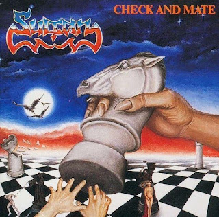
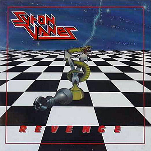


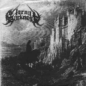
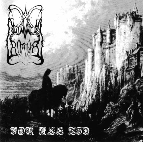


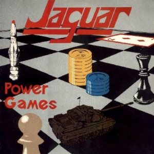
Vaggelis wrote:These three cover arts have many similarities
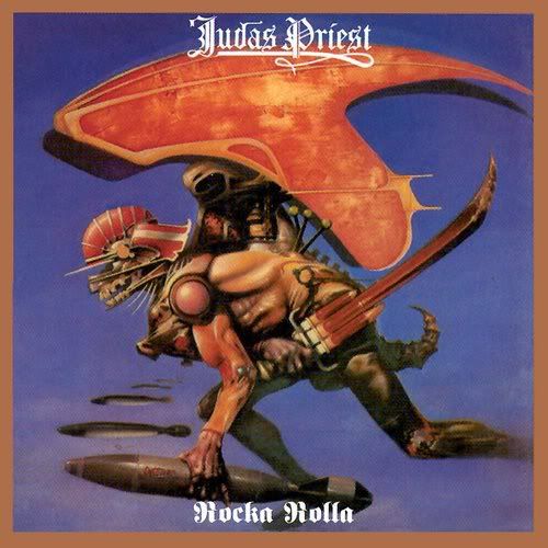
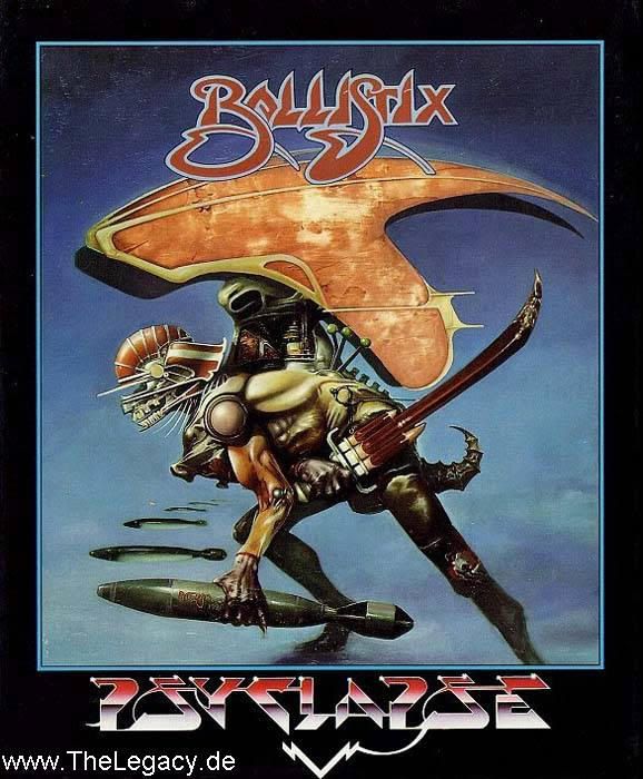
the fonts are stolen from the 80s/90s game studio psygnosis! (RIP)Bearer of the Black Sword wrote:
This cover is just terrible in all aspects.The Knell wrote:the fonts are stolen from the 80s/90s game studio psygnosis! (RIP)Bearer of the Black Sword wrote:
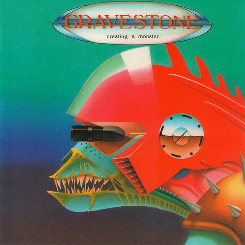
The head of that "what-ever-it-is" looks similiar to the one on this GRAVESTONE lp:Avenger wrote:This cover is just terrible in all aspects.The Knell wrote:the fonts are stolen from the 80s/90s game studio psygnosis! (RIP)Bearer of the Black Sword wrote:
well it looks like that robo dragon warrior dude is sporting a massively goofy face while clumsily dropping the bombs manually one by oneAvenger wrote:This cover is just terrible in all aspects.The Knell wrote:the fonts are stolen from the 80s/90s game studio psygnosis! (RIP)Bearer of the Black Sword wrote:
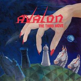
Don't forget this one:Vaggelis wrote:These three cover arts have many similarities