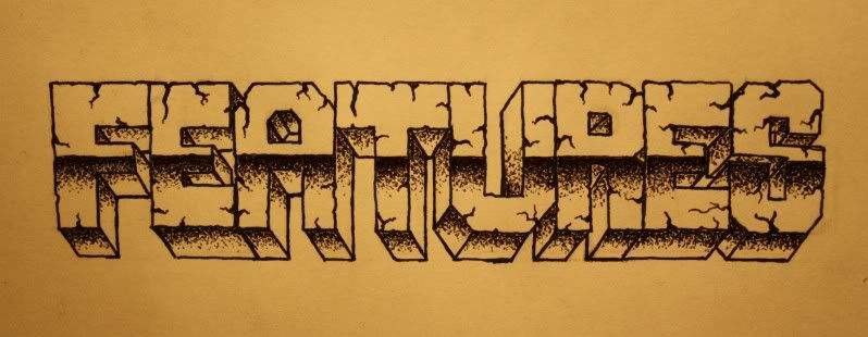
daniel wrote:Not too sure about this one, but here it is anyway:
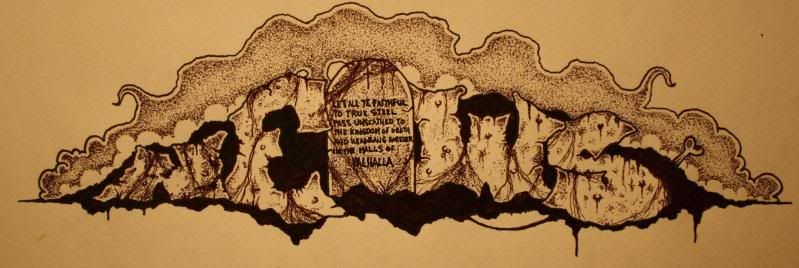
And on to more...
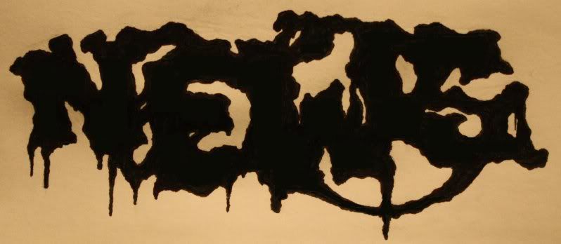
Beautiful. A bit too beautiful perhaps - it looks more like a mural than a logo to be honest. I think it's time for something simpler/more primitive</art critic mode>
I know, I get a bit carried away, but something simple, is just so...simple haha. I like to challenge myself slightly at least. But I can still try do another one if I get round to it
Are you the tyrant, who cast them to the sea?
One day you'll be among the dead.
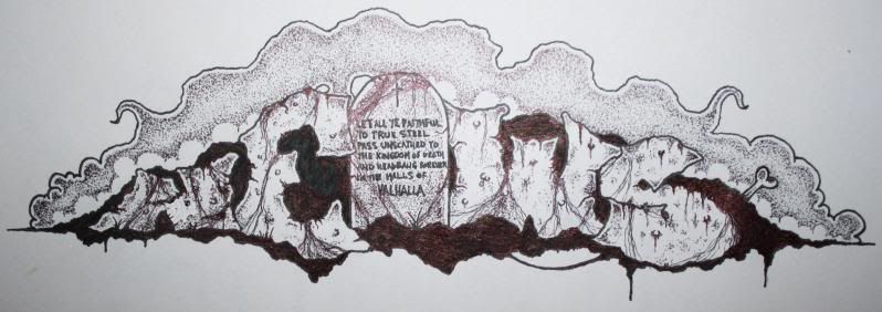
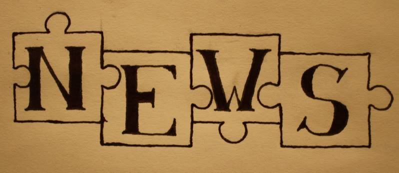
Almost forgot these, sorry. I like the puzzle-pieces the best! They're ugly, unmetallic and looks 100% like something a very early 80's band would actually use. Click'd & saved.
Shiiet!
I'm back, but I missed this one. Coulda, shoulda, woulda been much fun doin sumthin fer ya there, yes sir.
Anyways, ah gotz my Atomsko Skloniste LP this here day, an I'll tell ya bubba, it's snappin´!
Keep on rockin' & stay ugly!
"My music is not modern, it is merely badly played." Arnold Schönberg 1874-1951
Vinny Black wrote:Shiiet!
I'm back, but I missed this one. Coulda, shoulda, woulda been much fun doin sumthin fer ya there, yes sir.
Anyways, ah gotz my Atomsko Skloniste LP this here day, an I'll tell ya bubba, it's snappin´!
Keep on rockin' & stay ugly!
Damn, who the hell threw a computer-thingie your way? Welcome back dude..
There's still logos not yet done so get that pencil fired up. The studded arm on the main-page needs a conceptual companion...
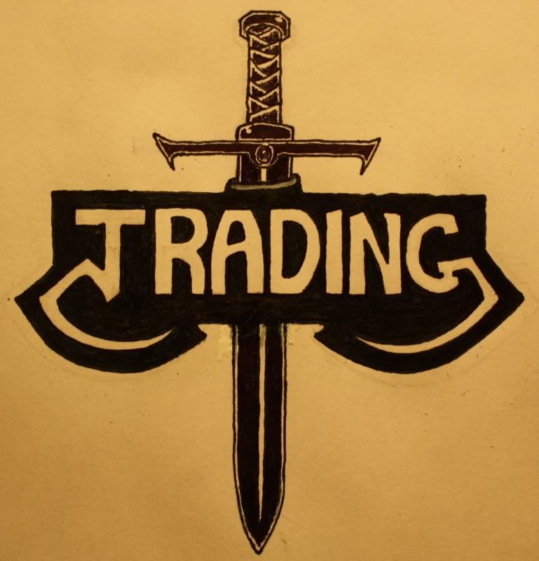
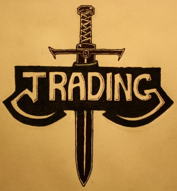
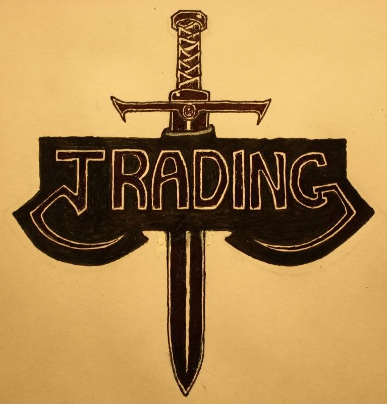
daniel wrote:Personally I like the 2nd one the best.
Me too, but both the 1st and 3rd ones have the advantage of having less of a "mature" quality though. Still the sword has an unmistakable quality of seeming more dangerous in the handle area than at it's not-too-sharp edge. Which, if in using it backwards, may well make it's swing as heavy as the spade's.